"Colour does not only add a pleasant quality to design—it reinforces it,” said French early-20th century painter and illustrator Pierre Bonnard; a claim that rings truer today more than ever with colour becoming an ever-more apparent element in the world of architecture and design.
Written by Nikolaj Hansson
Since the cones of our eyes have been able to decipher one colour from another, colours have been an integral part of our lives; even as our evolution as species, down to the point of survival where our eyes are better at recognizing colours such as red and yellow (think traffic lights) than those green and blue. However, our perception of colour is also highly subjective all the way down to our cultural and social identity as individual beings. Thus, when talking the topic of colour in the spheres of architecture and design, it’s important to emphasize that there is no right or wrong colour. Instead, it can be argued to be about considering the spatial context of a given setting when selecting the colours.
If one looks at colour from a geographic perspective, it becomes clear that geography too plays a part: Consider the colourful architecture of Mexico City, the subdued churches of white oak in Nordic countries or the vibrantly industrial sceneries of French coastal cities - the geographical and cultural upbringing of the architect bleeds into the identity of the buildings.
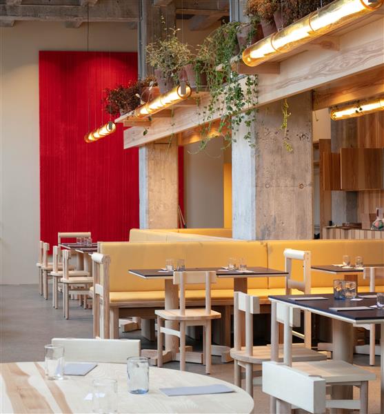
The new Popl Burger restaurant in Copenhagen, designed by Spacon & X, uses dashed colour scattered throughout to communicate the atmosphere of the restaurant.
Photo: © Bjørn Bertheussen
Copenhagen-based architect and co-founder of cross-disciplinary architecture studio Spacon & X Nikoline Dyrup Carlsen says: ”I find that the potential of colour in architecture is underappreciated, particularly in Scandinavia. Colour can have a profound impact on our perception of spaces. At Spacon & X, we often seek to pursue colour as a vehicle to communicate the values of the given project, be it a workplace DNA, the vibe in a restaurant or creating a welcoming feeling in a hotel.”

Vibrant blue and yellow hues are employed throughout the office of the Danish Safety Technology Authority, echoing the institution’s ethos of safety and wellbeing.
Designed by Spacon & X.
Photo: © Spacon & X
Here, it can be claimed that colour can be considered to be circumstantial at its heart—our perception of a colour depends on the context in which it is shown. Adding to her remarks, Dyrup Carlsen notes: “As humans, we find ourselves demanding more from the spaces that we inhabit. We’re through with using standard, white-cube options and are moving onto working from a point of sincere interest with regards to the identity and DNA of each material and surface.”

An installation by Margrethe Odgaard in the showroom of Danish textile company, Kvadrat, using colour as a means of communication for the company’s design values.
Photo: © Kvadrat
Turning the scope towards the use of colour within the world of design, one finds Danish textile and colour designer, Margrethe Odgaard. Known for her works of approaching colour as an encompassing sensory perception that can leave a positive mark on its viewer, Odgaard has worked with the likes of Kvadrat, Muuto, HAY and more along with her exhibitions at places that include Designmuseo Helsinki and Willumsen’s Museum. When asked how she approaches her work with colour, she says: “To me, it’s not as much a question of the colour itself but more of light—how the light meets the surface upon which the colour sits, how it is absorbed, how it is reflected and, ultimately, the energy that it reaches our eye with. Working with colour is to me a physical manifestation of light upon a surface that can nourish us and our senses.”

A series of curtain compositions by Margrethe Odgaard, studying the interaction of multiple colours across a patchwork-like layout. Created with Odgaard’s Panorama textile for Kvadrat at Munkeruphus Museum.
Photo: © David Stjernholm.
Though colour can seem like a never-ending study with infinite options, Odgaard argues that one must approach it with a decisive attitude: “You have to identify your intention with the colour. What emotional and perceptual effect do you want for it to evoke? Which context will it live and work in? You need to have a clearly defined vision and direction from which you can set out from.”
.jpg)
The Popsicle Index: Studies in Sensory Perception (2018) by Margrethe Odgaard.
Photo: © Andreas Omvik
Alas, it seems that though our perceptions of colour come down to a multitude of things with our individuality reigning supreme, one can certainly argue that regardless of the perception, context is a crucial factor to consider when working with colour, be it for the walls of a restaurant, the shade of a textile curtain or the hue of a chair.